
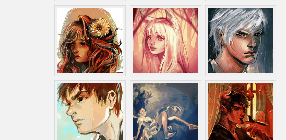
實現效果
實現代碼
html
Thumbnail Hover Effect with CSS3
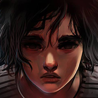
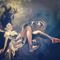
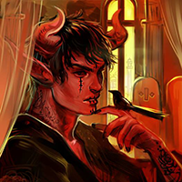
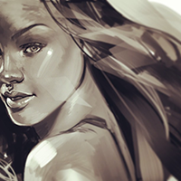

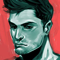
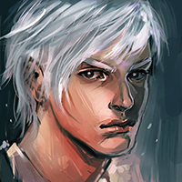

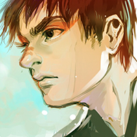
Images featured in this demo are the works of Mernan Behairi. Inspired by an old post of @Sohtanaka. It originally uses jQuery. Access original tutorial and demo.
css3
@import url(https://fonts.googleapis.com/css?family=Roboto+Condensed:700); html, body, div, span, applet, object, iframe, h1, h2, h3, h4, h5, h6, p, blockquote, pre, a, abbr, acronym, address, big, cite, code, del, dfn, em, img, ins, kbd, q, s, samp, small, strike, strong, sub, sup, tt, var, b, u, i, center, dl, dt, dd, ol, ul, li, fieldset, form, label, legend, table, caption, tbody, tfoot, thead, tr, th, td, article, aside, canvas, details, embed, figure, figcaption, footer, header, hgroup, menu, nav, output, ruby, section, summary, time, mark, audio, video { margin: 0; padding: 0; border: 0; font-size: 100%; font: inherit; vertical-align: baseline; } body { background-color: #f2f2f2; } header { width: 100%; background-color: #77cdb4; text-align: center; } h1 { font-family: 'Roboto Condensed', sans-serif; color: #FFF; font-size: 2.3em; } em { color: #232027; } .wrapper { width: 40%; margin: 40px auto; } div.gallery { margin-top: 30px; } div.gallery ul { list-style-type: none; margin-left: 35px; } /* animation */ div.gallery ul li, div.gallery li img { -webkit-transition: all 0.1s ease-in-out; -moz-transition: all 0.1s ease-in-out; -o-transition: all 0.1s ease-in-out; transition: all 0.1s ease-in-out; } div.gallery ul li { position: relative; float: left; width: 130px; height: 130px; margin: 5px; padding: 5px; z-index: 0; } /* Make sure z-index is higher on hover */ /* Ensure that hover image overlapped the others */ div.gallery ul li:hover { z-index: 5; } /* Image is position nicely under li */ div.gallery ul li img { position: absolute; left: 0; top: 0; border: 1px solid #dddddd; padding: 5px; width: 130px; height: 130px; background: #f0f0f0; } div.gallery ul li img:hover { width: 200px; height: 200px; margin-top: -130px; margin-left: -130px; top: 65%; left: 65%; } p.attribution { font-family: 'Consolas'; color: #000; clear: both; text-align: center; line-height: 25px; padding-top: 30px; } p.attribution a { color: #4c8d7c; } /* Responsive hack */ @media only screen and (min-width: 499px) and (max-width: 1212px) { .wrapper { width: 500px; } } @media only screen and (max-width: 498px) { .wrapper { width: 300px; } div.gallery ul { list-style-type: none; margin: 0; } }
以上就是CSS3 實現的縮略圖懸停效果的詳細內容,更多關于CSS3 縮略圖懸停的資料請關注html中文網其它相關文章!
版權所有:廣州騰虎網絡科技有限公司
粵ICP備13073147號 


